We saw what New York had to offer in it’s fashion stakes, now onto London!
As one would expect, London Fashion Week’s Spring/Summer collections were ever so slightly less spring-y than New York’s. Not that that’s a bad thing – it’s just colder in the kingdom, you know? If that’s the kind of high-fashion commentary you’re after, read on for a rundown of a few of my favourites from LFW S/S ’16.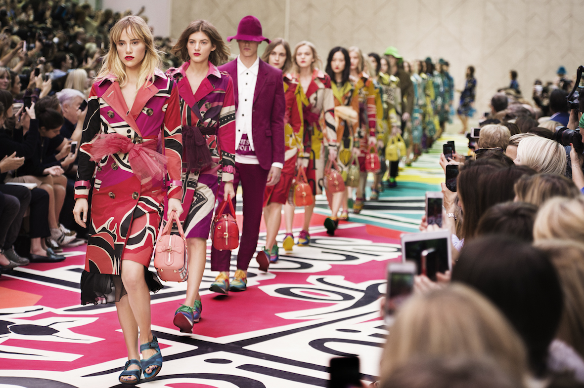
Technology has been all the rage with the fashion crowds this season. Burberry Prorsum previewed their mega S/S ’16 collection on Snapchat – and that was after their recently announced partnering with Apple Music. The show was about as British as you might expect a Burberry collection to be, complete with UK-made lace and metallic cording made by the same embroiderers that the Queen’s Guard uses. Despite the fact that I’m very much over sheer dresses, I actually really liked this (above) romantic merlot-coloured gown. I think the classic silhouette gives it an interesting edge, and the dots add a sweet, fresh touch.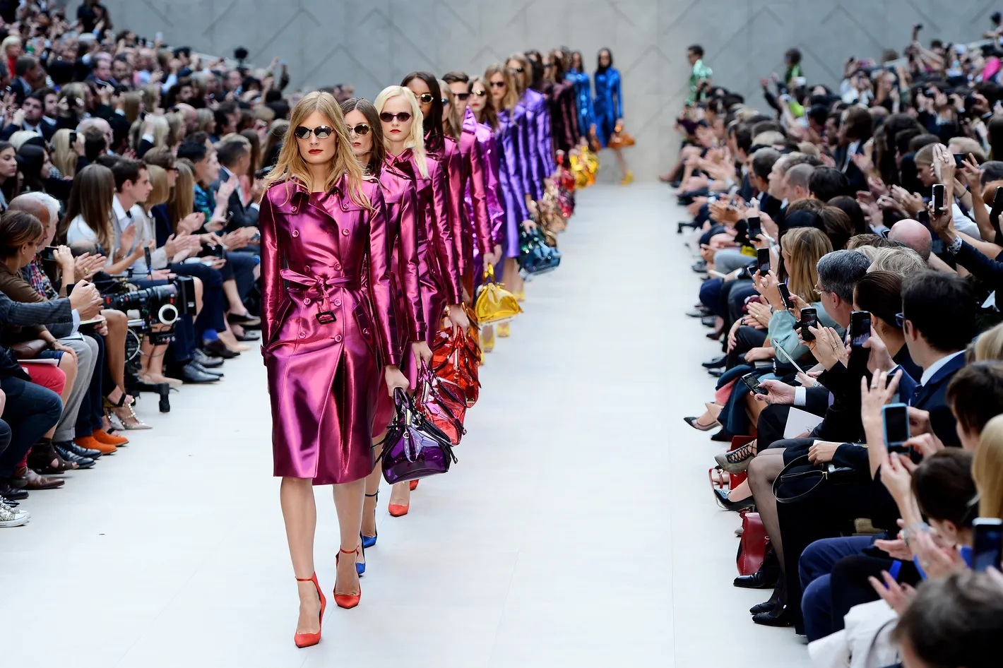
Duro Olowu’s muse for his S/S ’16 collection was the artist Amrita Sher-Gil: the woman sometimes known as India’s Frida Kahlo. Duro Olowu’s collections are always boisterous, and his S/S ’16 offering is no exception. Brimming with bold colours and clashing patterns that somehow seem to always work, the cut of the collection is what elevates it. As strong as they are vibrant, the clothes of Duro Olowu are unabashedly feminine. Although this dress (above) is not something I would usually go for, the delicate florals on the hem and the sleeves mixed with the bold black and yellow on the body of the dress, just grabbed me for some reason.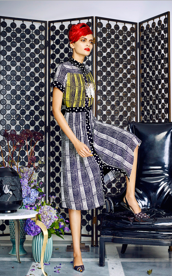
Richard Diebenkorn was an American painter. His work fits into several movements – abstract expressionism and colour field painting, to name a couple – but it is his ‘Ocean Park’ series that really garnered him acclaim. So what happens when you get Diebenkorn’s ‘Ocean Park’ paintings together with the design aesthetic of the Memphis Group? Edeline Lee’s S/S ’16 collection, that’s what. Bursts of colour are what defines the collection, which is fresh and fun. I really liked this geometric print dress (above). The pastel tones really pop off the black, and the print is what makes the simple cut of the dress so much more interesting.
If you’ve been paying any attention to the fashion commentary surrounding the gliterati over the past few months, you might have noticed some titillation over it-girls rocking up wearing lacy dresses emblazoned with sex. And yes, I do mean that quite literally. Christopher Kane’s Fall ’15 collection was sexy, complete with electric orgasms and glittering nudes, but his S/S ’16 collection was something else. Colourful zip-ties livened up some of the simple black dresses, and the mix of materials was not only intriguing to look at, but also classic Kane. The brash jolts of colour have Kane saying something quite different than last season, and this (above) sexy slip dress adorned with jagged shards of colour is a really interesting example.
Markus Lupfer has a formula. His collections are usually solidly similar in their foundations, but his use of interesting patterns and flattering cuts are what keeps him going, and in turn keeps us interested. The inspiration for his jaunty patterns this S/S ’16 season? Flowers and Mexican wrestlers. I don’t quite comprehend how he got there, but the resulting patterns are certainly unto themselves. I really loved this simple shift, made somewhat more interesting by the wave of lace swirling around the hem. The rest of the interest is in the fabric of course; in the wrestlers floating around like spacemen, clutching flowers and dodging daisies.
S/S ’16 was only Mother of Pearl creative director Amy Powney’s second outing – not that anyone could tell. The clothes that sauntered down the runway at the Café Royal were pretty, and pretty solid as well. Inspired by photographs of a closed farming community called the Hutterites of Montana, the designer described her collection as Victoriana-meets-Midwestern. Although all was not quite as innocent as it seemed, and the patterns of the clothes are what really elevated them. You can’t tell by looking at my pick, this (above) smock dress laden with a veritable field of flowers, but other prints that made their way down the runway included comb carrying lobsters and birds admiring themselves in looking glasses.
I like classic lines. I love classic styles. I have on more than one occasion been accused of dressing too monochromatically. Some might call this (above) simple white dress from Paul Smith’s S/S ’16 showing boring – but not me. I love it. I feel like this is one of those dresses you could invest in: buy now, wear it again and just as well in ten years. The show was held at the Serpentine Galleries, and inspired by the colours used by artist David Hockney (I swear that all of this art-overlap is pure coincidence). As you would expect from a guy who predominantly makes suits, Sir Paul Smith gives good pant. The tailoring of the collection was stellar, and the interesting accessories are worth a mention as well: how do you like that harmonica bag (above)?
I said in my review of the New York shows that I was having trouble getting on board with culottes. I’m standing by that statement. I just don’t get culottes. I also don’t understand why we’re bringing back satin, but that’s neither here nor there. Peter Pilotto did not have a heavy satin presence in his S/S ’16 collection, but he sure did have a lot of culottes. That’s not why I’m writing about him though – I’m writing to tell you about his dresses. Famous for his heavily patterned numbers, some remain to be convinced by the designer’s obvious efforts to move away from the style that made him such a hit in the first place. I am more convinced than not, if this dress (above) is anything to go by. This tiered number looks to me a bit like someone took an outdated pheasant dress and worked it into something genuinely exciting.
Preen by Thornton Bregazzi almost always appeals to me, on some level. I don’t know if in recent memory the brand have had an outing that I haven’t liked at least a couple of pieces from, and S/S ’16 continued to deliver on that promise. Romantic and lacy with a palette of pinks and blues, the collection certainly isn’t a boring one. Peppered with interesting cutouts and surprising splashes of other colours (orange), the shape of the collection is solid and utterly wearable. Part of what makes this look (above) from the collection a favourite of mine, I think, is the styling. I like the flat shoe and the kitschy sunglasses as much as I do the flattering cut of the lace top, and the deep shade of the sumptuous skirt.
Whilst I’m not daring enough – fashion-wise – to be enamoured with the whole slate of looks from any given Jonathan Saunders collection, I generally find myself falling in love with at least one piece. Usually more than one, as was the case with his S/S ’16 collection, but especially this (above) one. The surprisingly sunny (for London) spring showing was nothing short of kaleidoscopic in spectrum, and the dress I most liked is a bit of a colour capsule. It feels like a holiday, this dress. It’s the everything of it: the colours, the pattern, the obvious nod to something of a kimono – it all just works. And the flattery of the cut shouldn’t be discounted either, because it’s not many designers whose clothes can be worn by more than a very small number of women who are of a very specific ilk.
So with that, the second chapter of our adventures in S/S ’16 fashion comes to a close. Next up: Milan.
